Designer
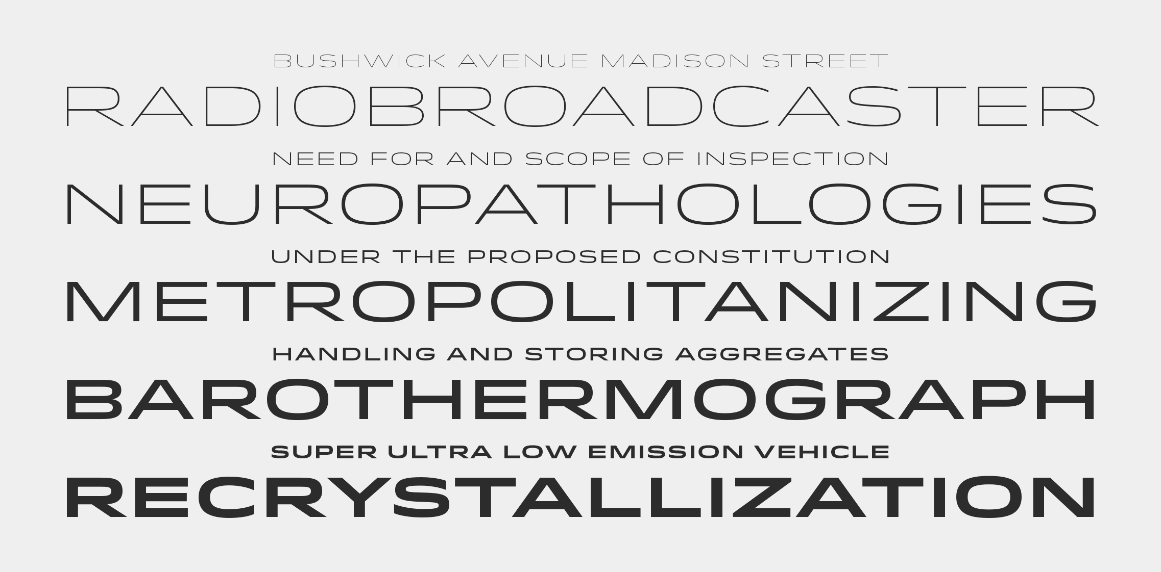
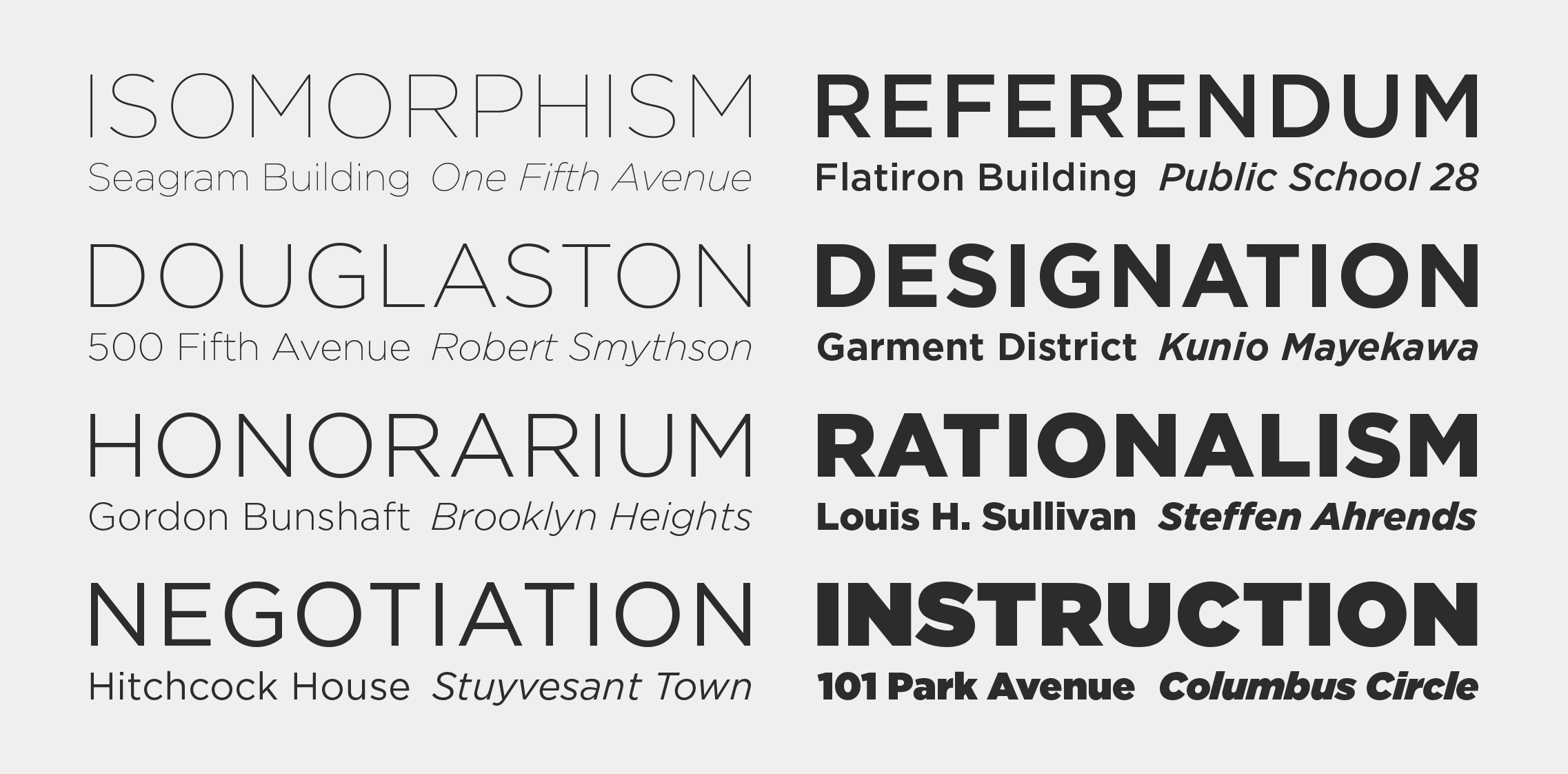
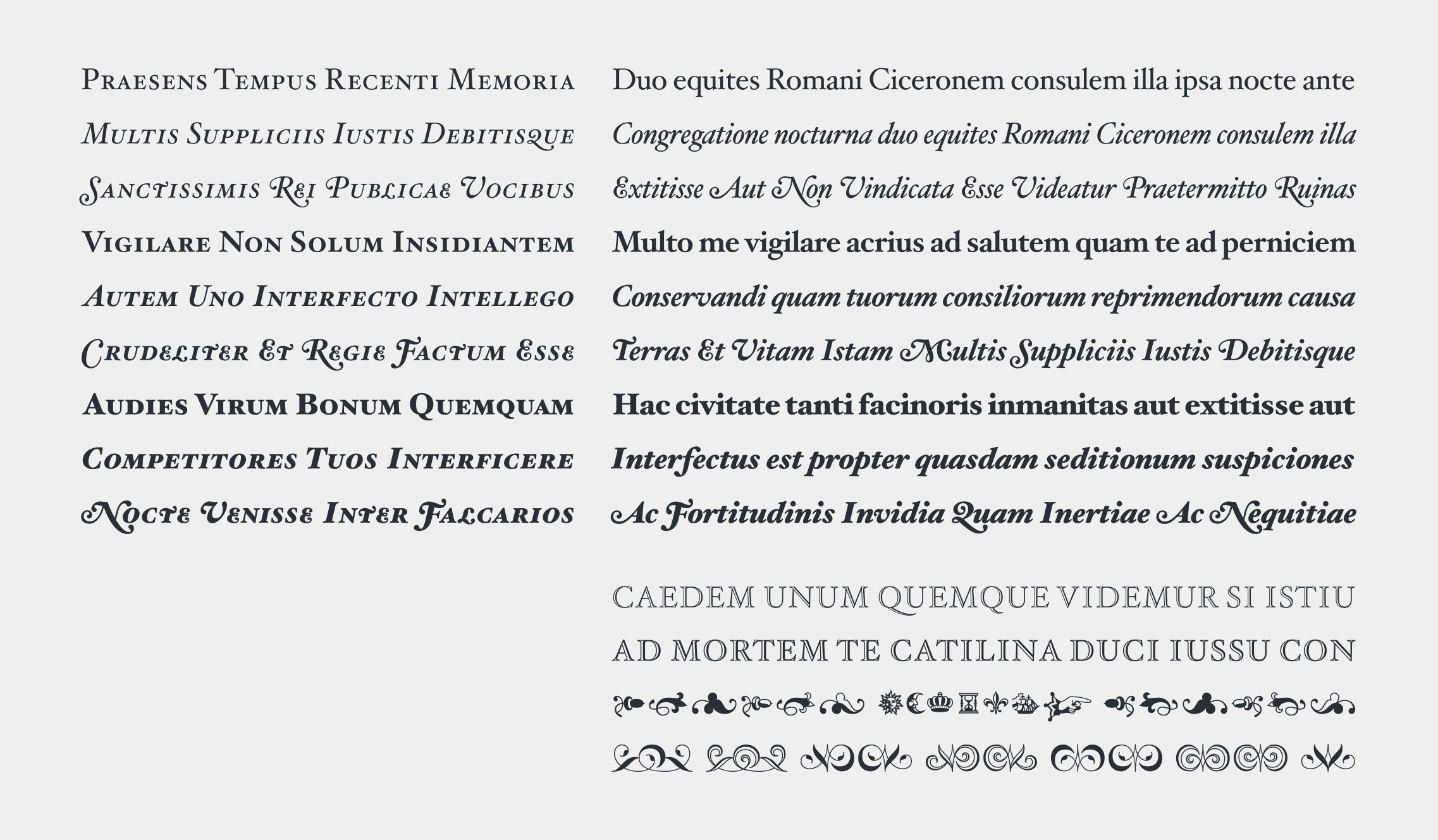
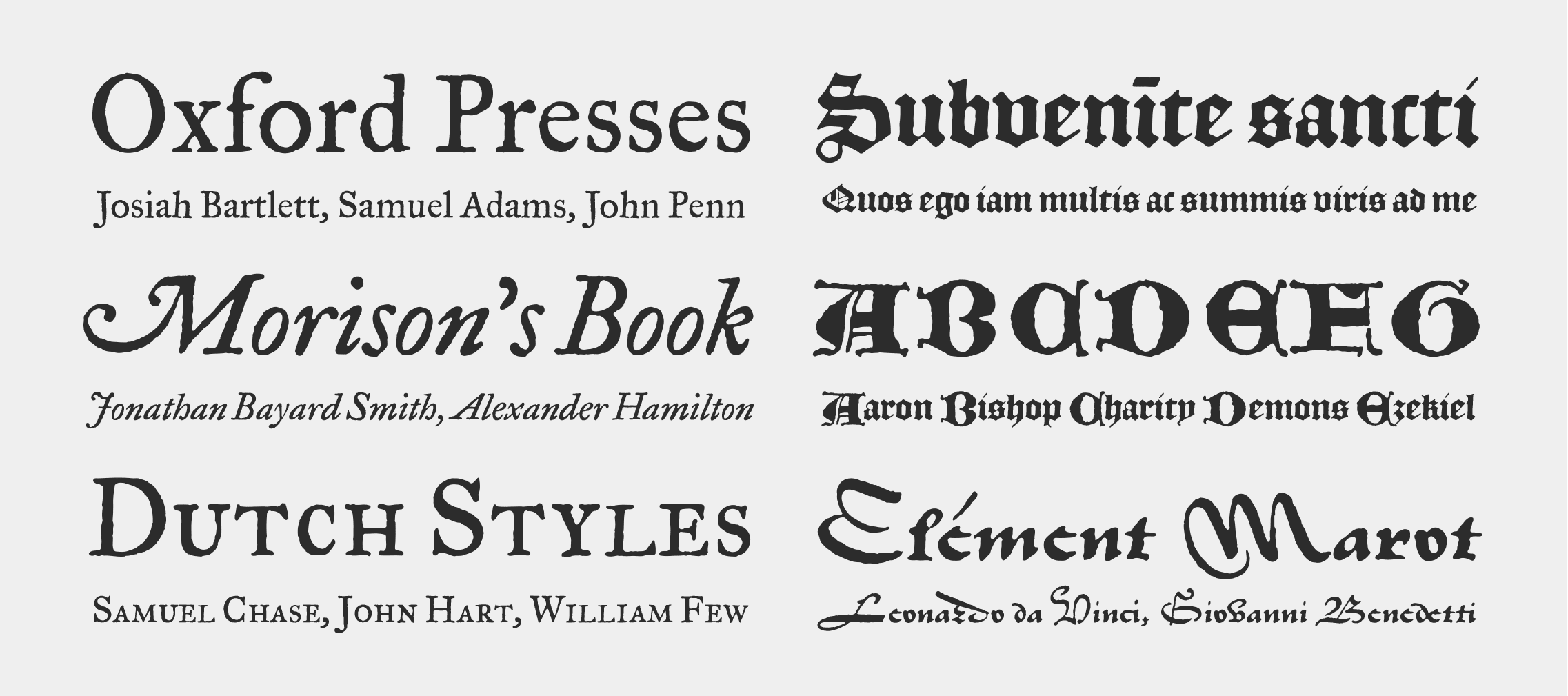
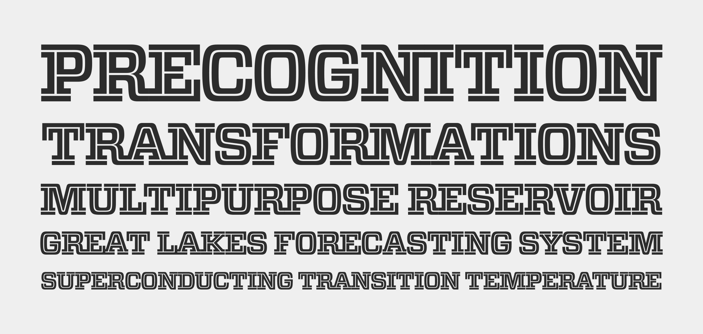
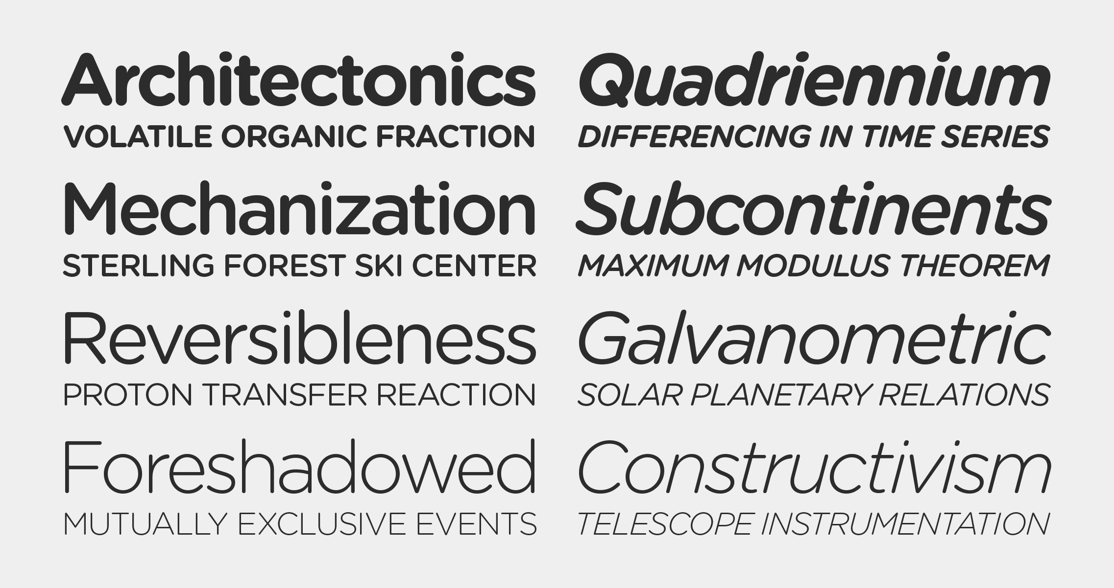
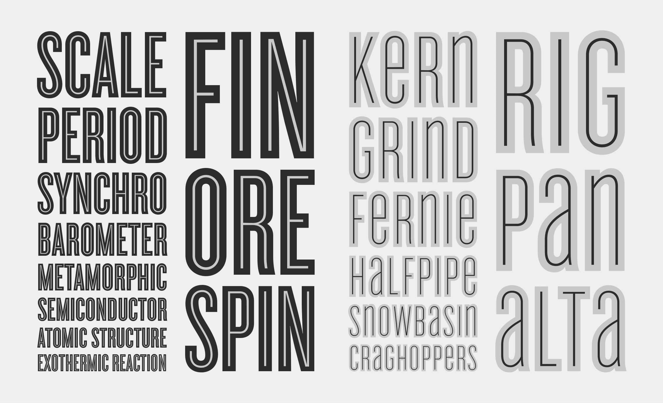
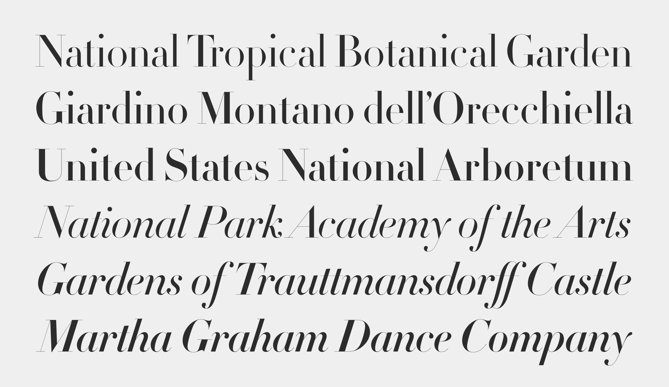
Jonathan Hoefler designs typefaces the way architects design buildings, every curve load-bearing, every decision historical and intentional at once. He founded his New York studio as a teenager and built one of the most consequential type libraries in the discipline's history: Hoefler Text ships on every Apple device on earth, and Gotham became the default typeface of American ambition, stamped on campaign materials and cast into the facade of One World Trade Center. He draws from Renaissance letterforms, nineteenth century slab serifs, and Baroque italics, then remakes them into something that holds up at nine pixels or nine feet. His work is everywhere and almost nobody knows his name, which is the highest compliment a typeface can receive: it disappeared into the language.
Learn More →Signature Traits
Major Works
Hoefler Text (1991)
Commissioned by Apple, shipped with every Mac ever made since. A renaissance-informed serif that proved serious typography belonged on personal computers.
Gotham (2000)
Geometric sans-serif drawn from mid-century American vernacular lettering. Became the typeface of the Obama campaign, One World Trade Center, and a generation of American institutional identity.
Sentinel (2009)
A slab serif of extraordinary warmth and range. Sixteen styles from hairline to ultra black. The typeface that proved historical forms could feel completely contemporary.