Designer
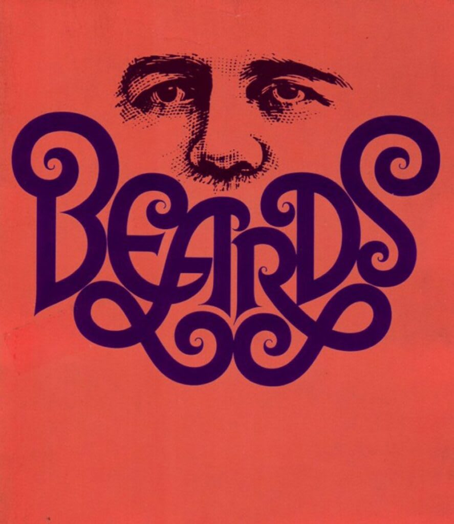
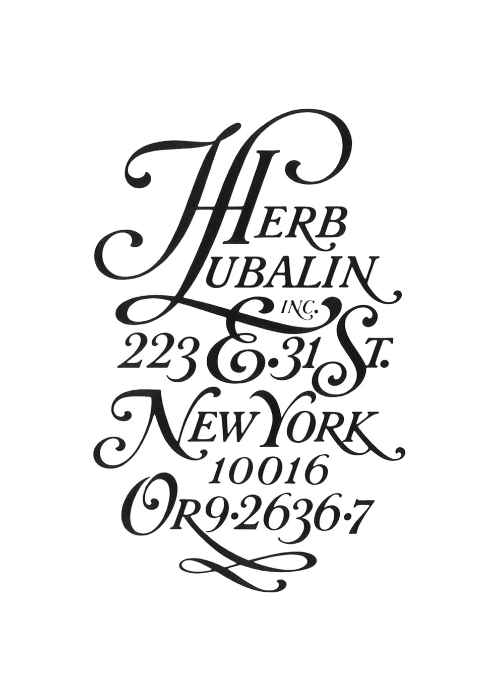
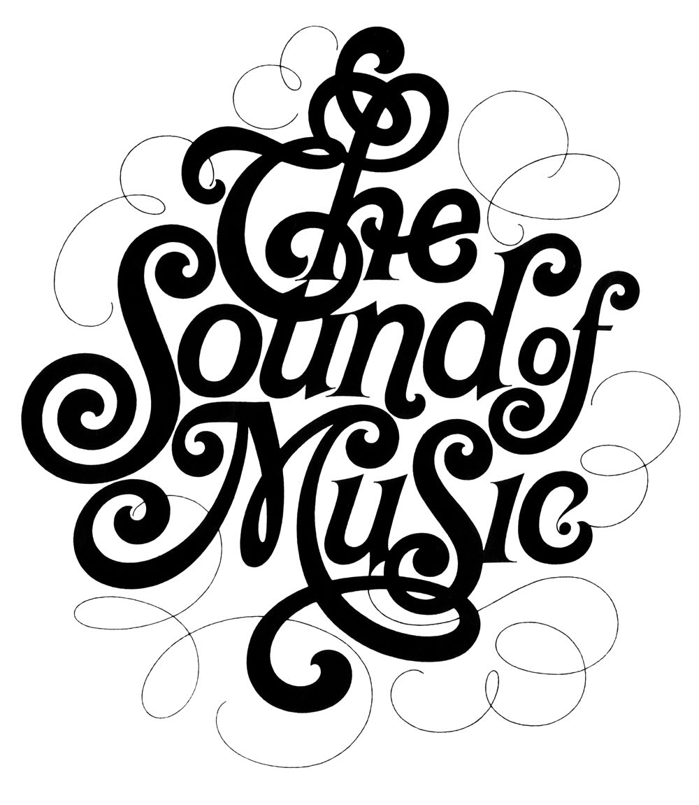
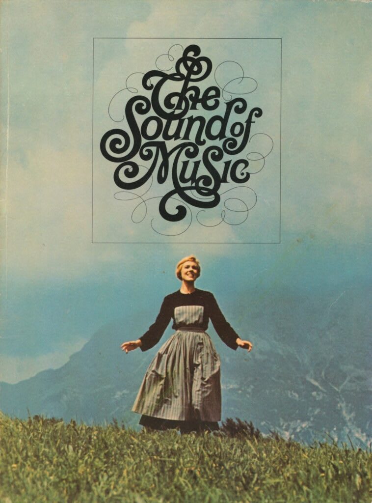
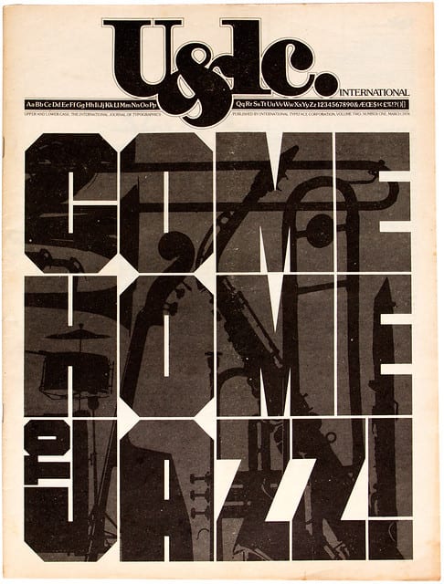
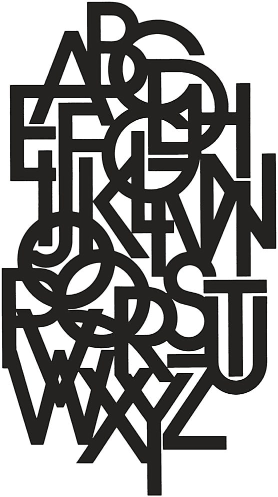
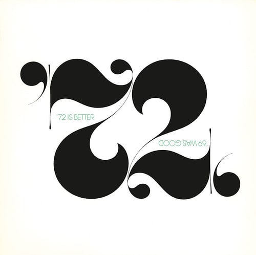
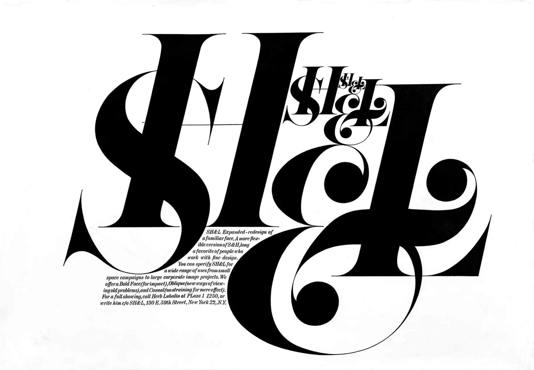
Herb Lubalin treated typography as architecture and emotion simultaneously. Working in New York through the 1960s and 70s, he transformed the typeface from a neutral carrier of language into a charged, expressive visual event. His magazine designs for Eros, Fact, and Avant Garde pushed typography to its conceptual limits, and the Avant Garde typeface he designed with Tom Carnase became one of the most recognisable and influential letterforms of the twentieth century.
Learn More →Signature Traits
Major Works
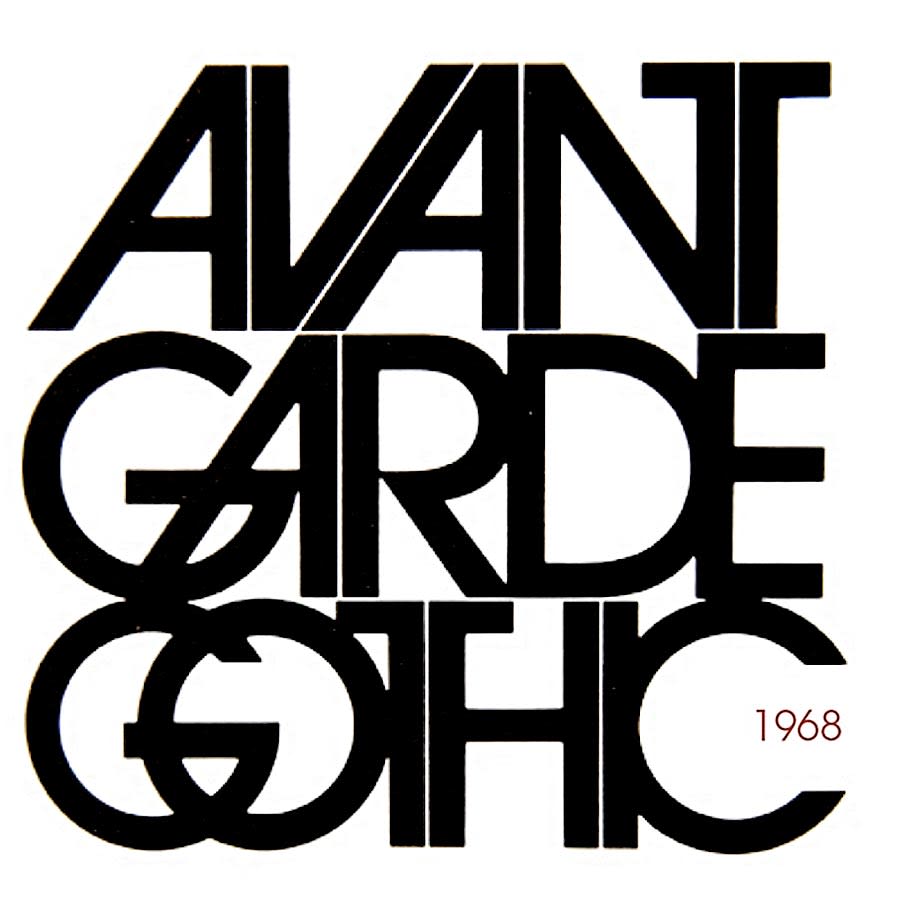
Avant Garde magazine (1968–1971)
The most visually adventurous magazine in American history. Every issue a typographic event.
ITC Avant Garde Gothic (1970)
The typeface derived from the magazine's logo. Still everywhere, still electrifying when used correctly.
Mother & Child logotype
Two words. Perfectly letterspaced. The infant tucked inside the ampersand. Still the most elegant piece of visual wordplay ever made.
Herb Lubalin: American Graphic Designer (Monograph)
Adrian Shaughnessy's survey of a career built almost entirely on letterforms, tracing the path from Avant Garde magazine through decades of typographic experiments most designers only encounter in fragments.