Designer
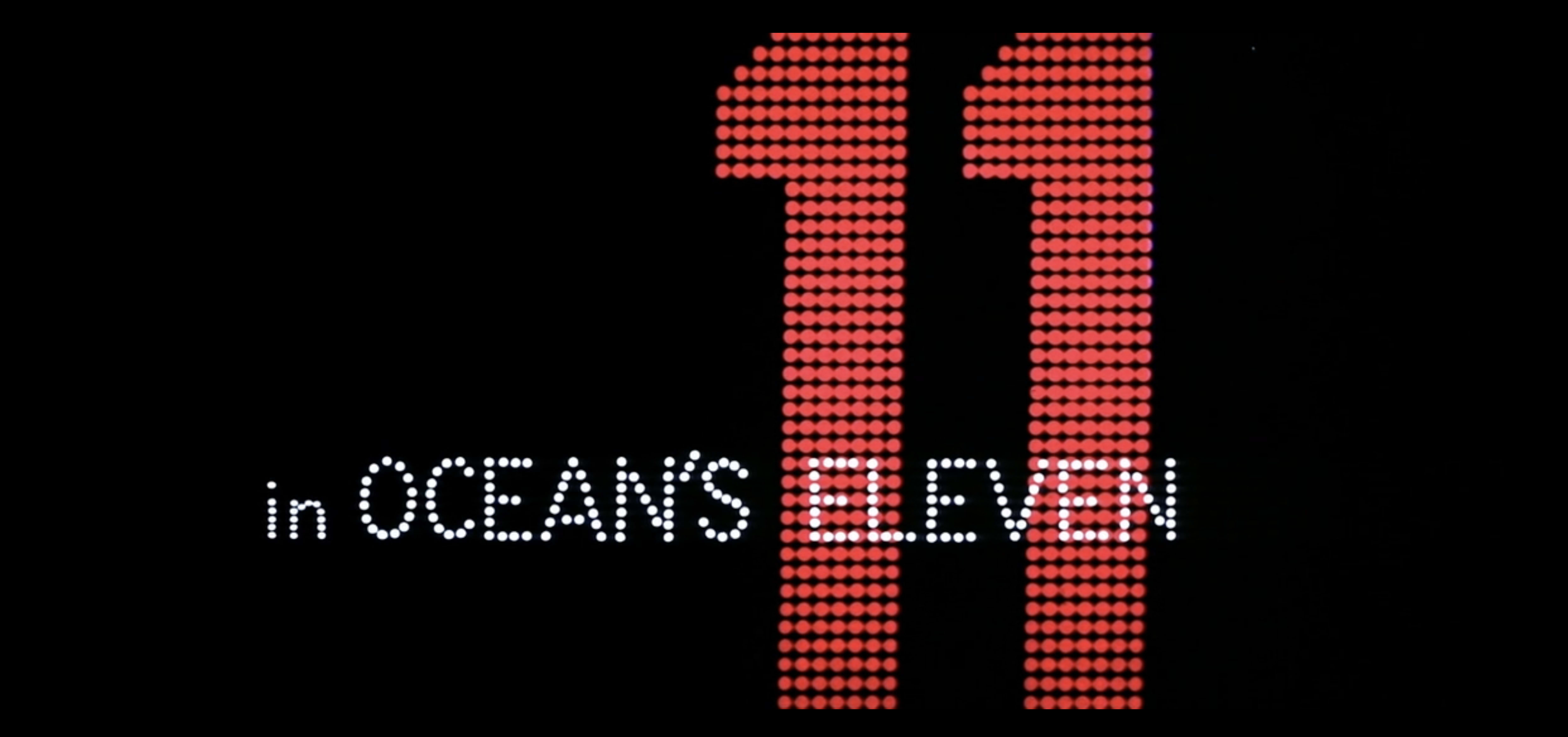

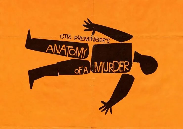
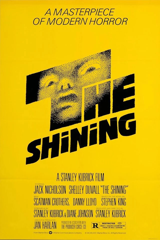
Saul Bass changed what a film could do before it started. His title sequences for Hitchcock, Preminger, and Scorsese weren't opening credits, they were arguments, moving pieces of graphic design that put you inside a film's nervous system before a single actor appeared. He brought the Bauhaus sensibility he absorbed from Gyorgy Kepes at Brooklyn College into the movie industry, and the movie industry was never the same. Outside cinema he built some of the most enduring corporate identities in American commerce, AT&T, United Airlines, Quaker Oats, Girl Scouts, logos so confident and cleanly resolved they've barely been touched in half a century. He operated across two worlds that don't usually speak to each other and mastered both.
Learn More →Signature Traits
Major Works
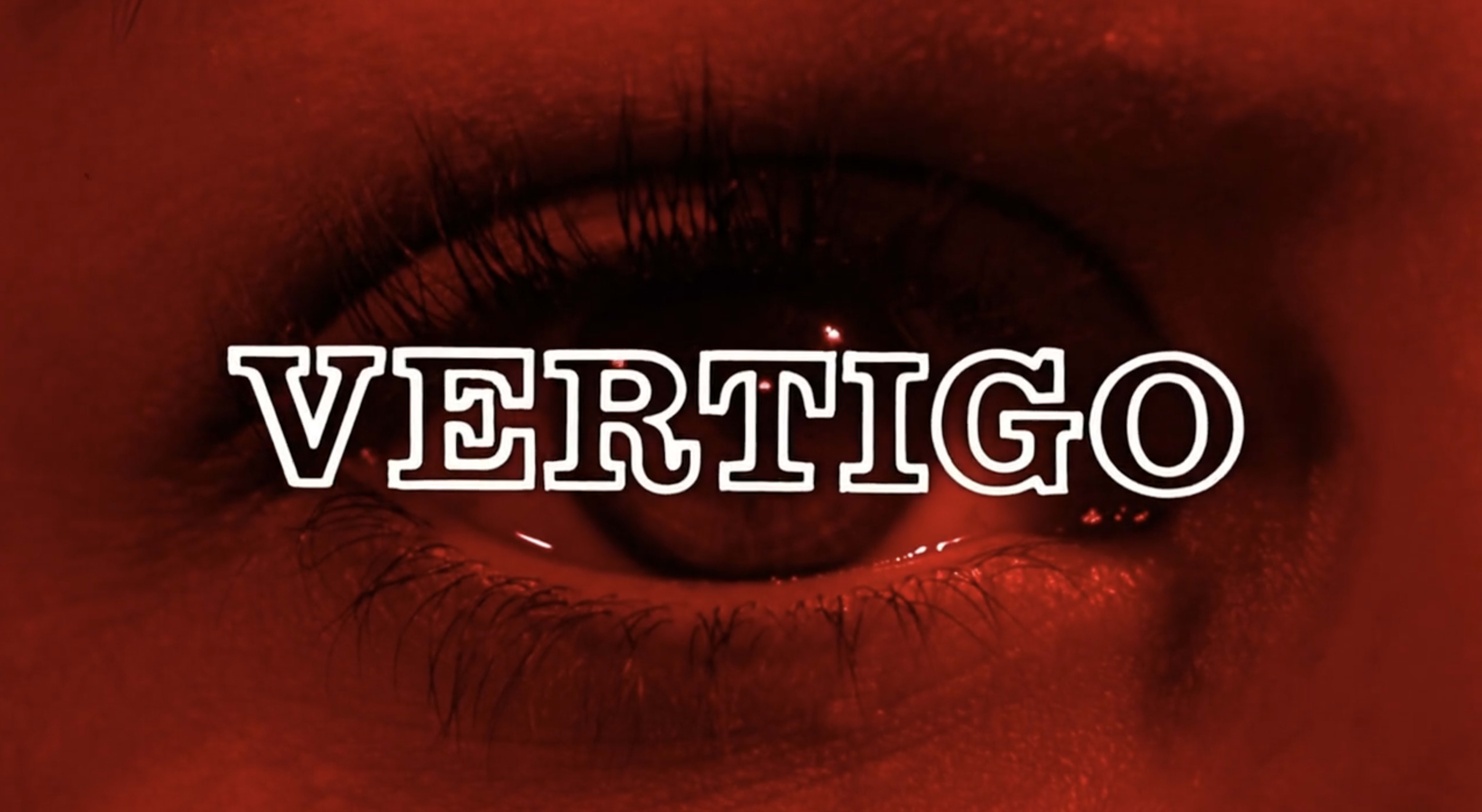
Vertigo title sequence (1958)
Spirals from a human eye. Bernard Herrmann's score underneath. The most psychologically precise opening in cinema history.
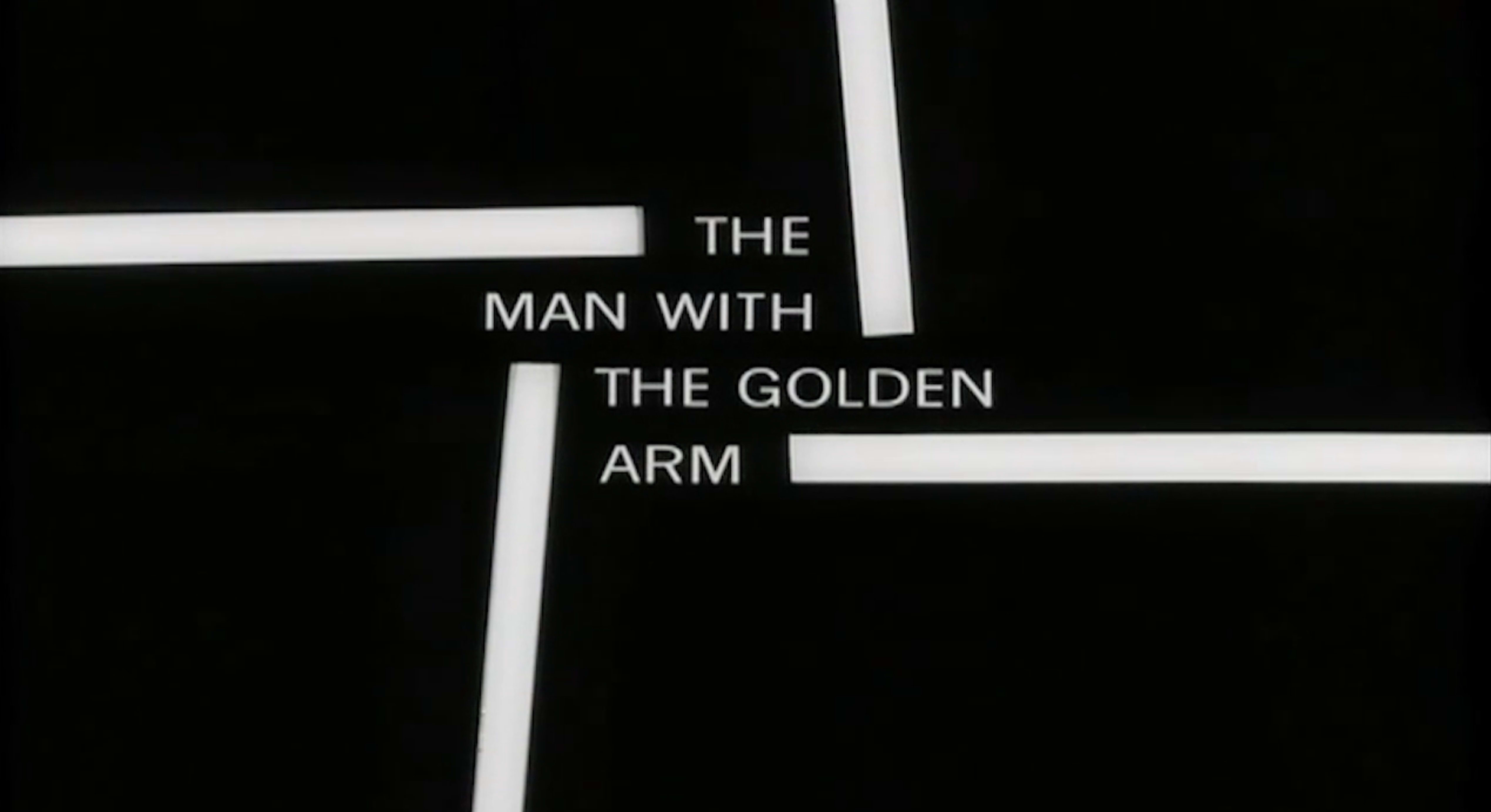
The Man with the Golden Arm (1955)
A jagged arm. White bars. Jazz. It invented the modern film title sequence and nobody has fully surpassed it.
AT&T logo (1983)
The Death Star globe, his critics called it. Fifty years later it is still the company's face. That is what correct looks like.
Saul Bass: A Life in Film & Design (Monograph)
Written by his daughter Jennifer Bass with Pat Kirkham. The fullest account of his career ever assembled, spanning title sequences, corporate identity work, and the short films he made purely for himself.