Designer

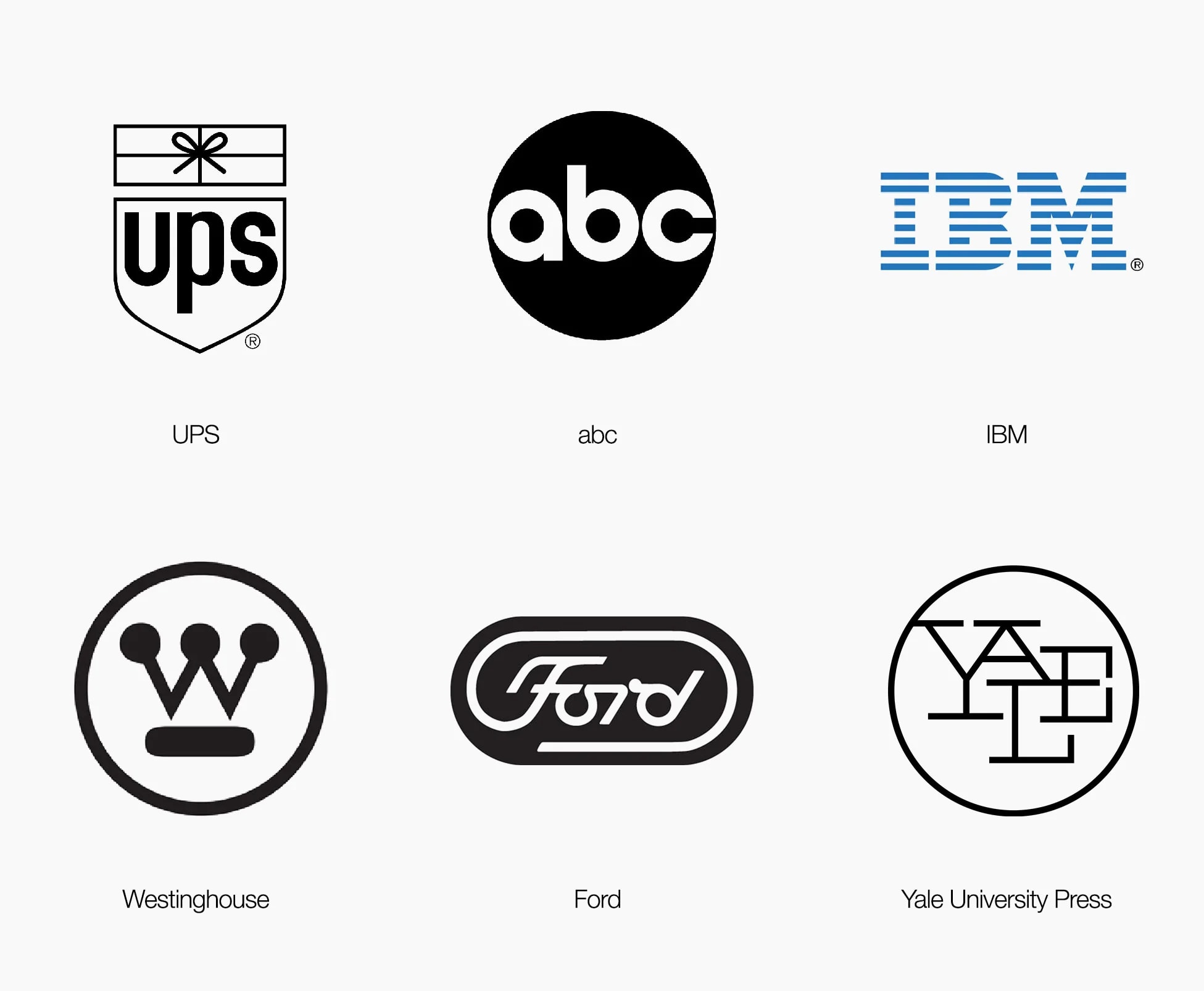
Paul Rand was the American designer who decided that commercial art was still art. He brought European modernism, Bauhaus rigour, Constructivist energy, into the boardroom, and in doing so created some of the most enduring marks in the visual history of capitalism. IBM. ABC. UPS. Each one a philosophy compressed to a symbol.
Learn More →Signature Traits
Major Works
IBM Rebus poster (1981)
Eye. Bee. M. Modernism and wordplay fused. Still the most elegant logo presentation ever made.
ABC logo (1962)
A circle, some letters. Fifty years of broadcast identity.
Thoughts on Design (1947)
The manifesto. Still required reading for anyone who touches visual communication.
Design, Form, and Chaos (Monograph)
Rand's own writing on the discipline he helped define. Essays and case studies from a man who believed a logo was a philosophy compressed to a symbol, told this time in his own words.