Designer
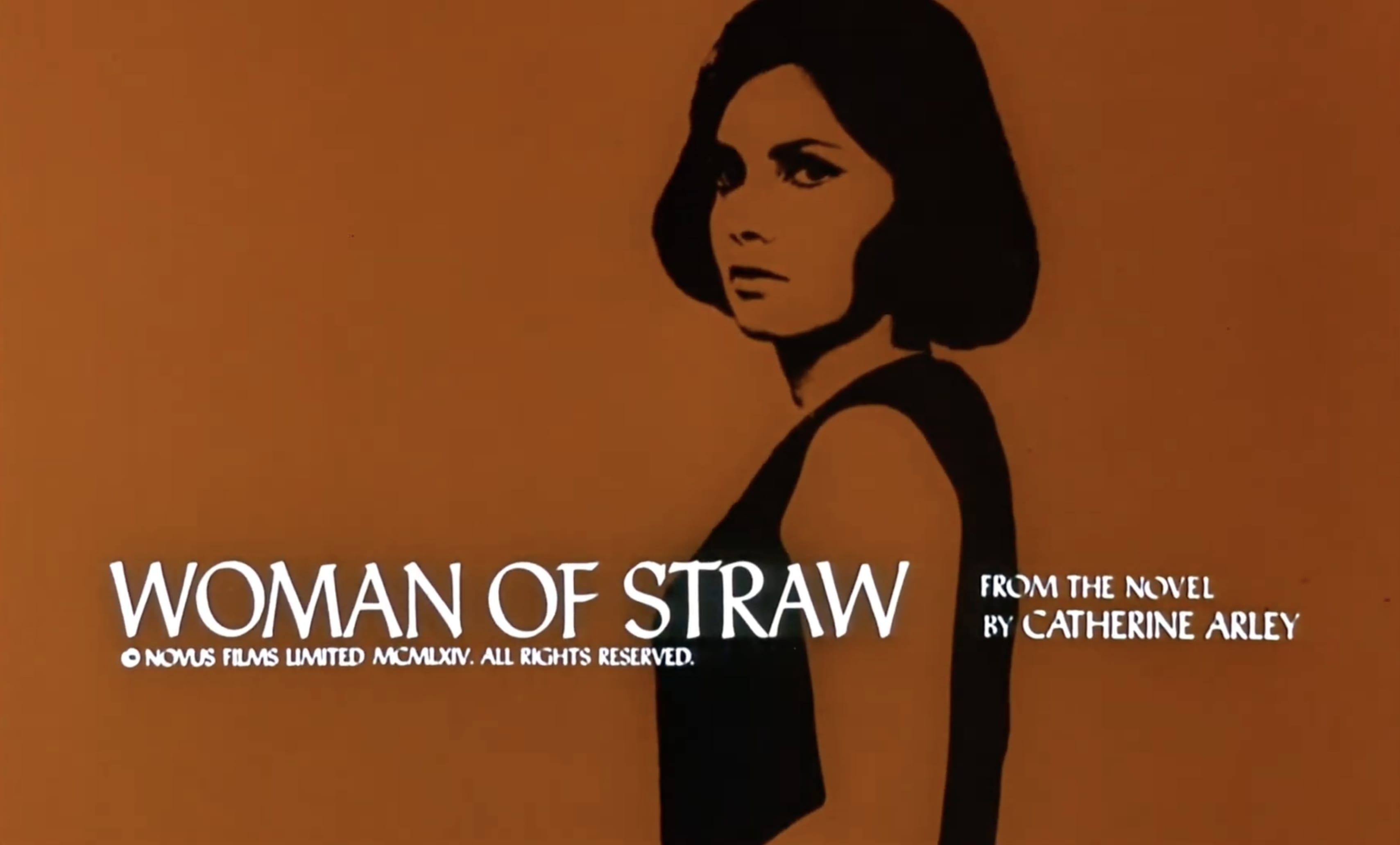
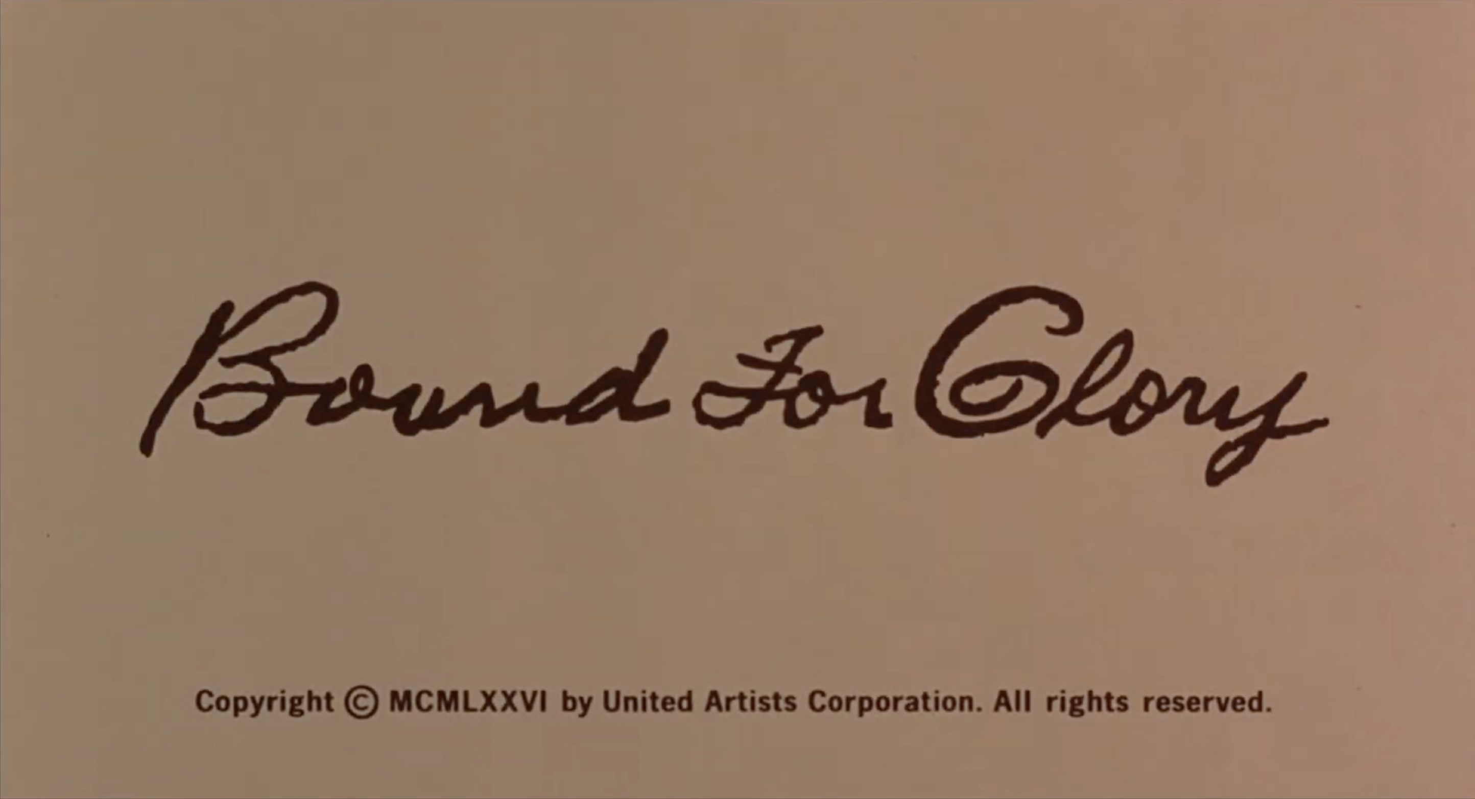
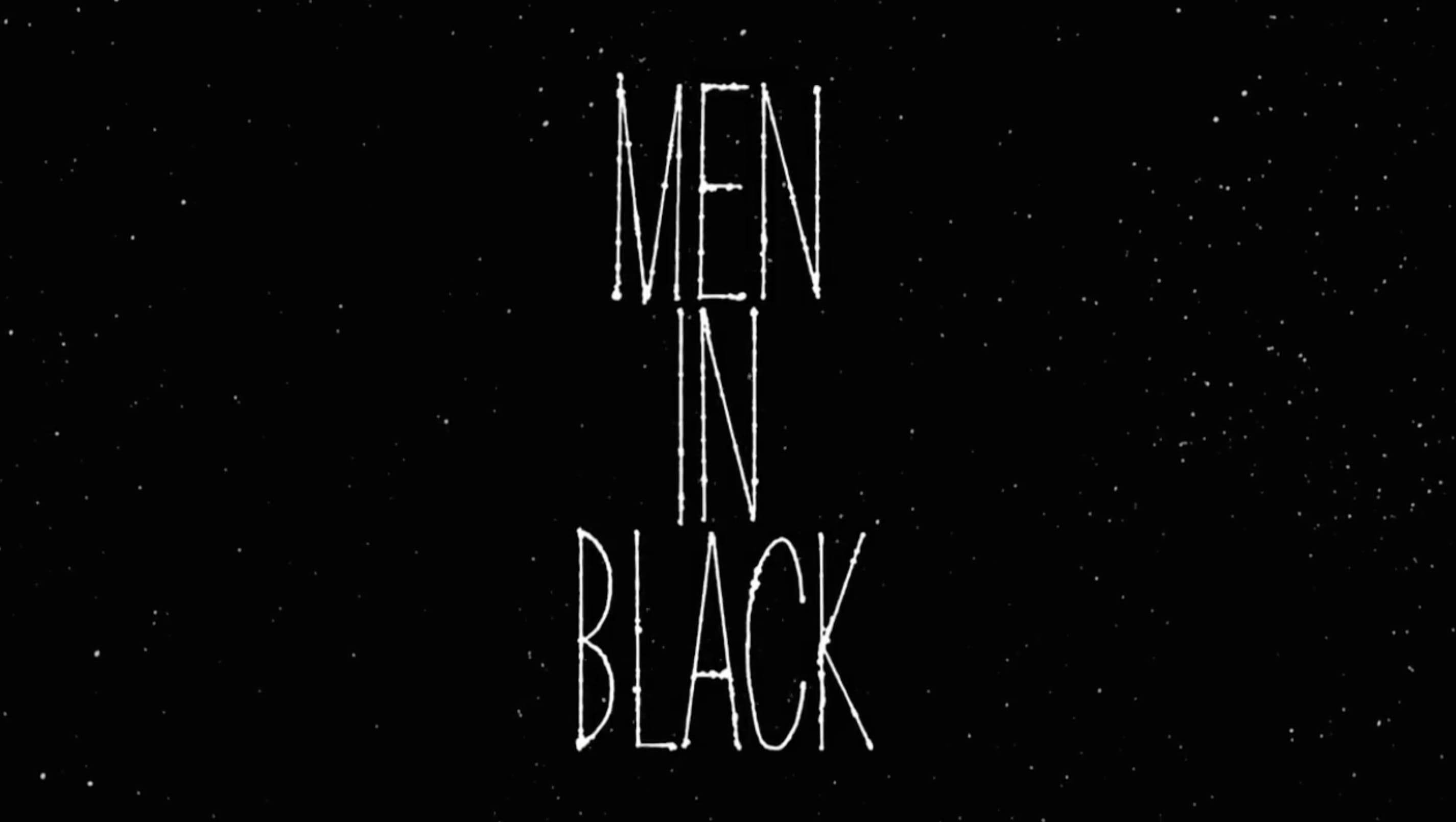
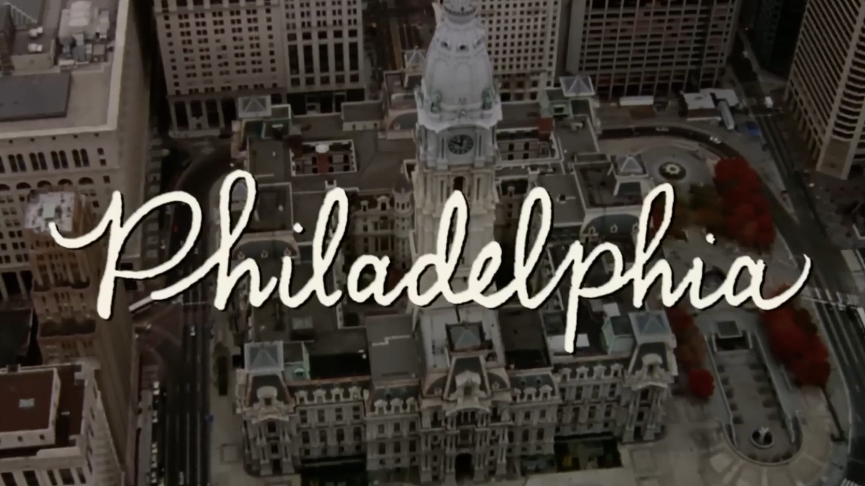
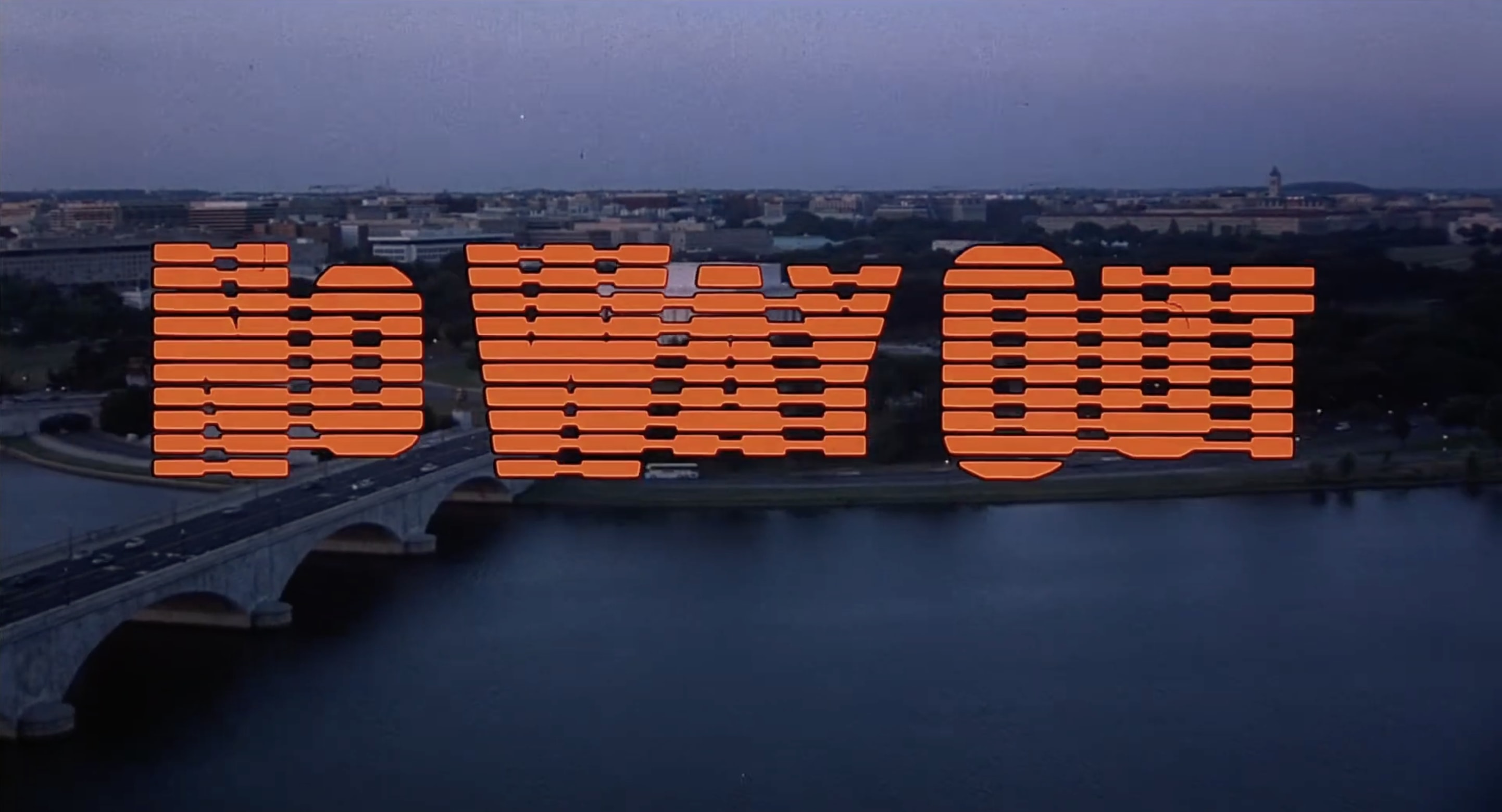
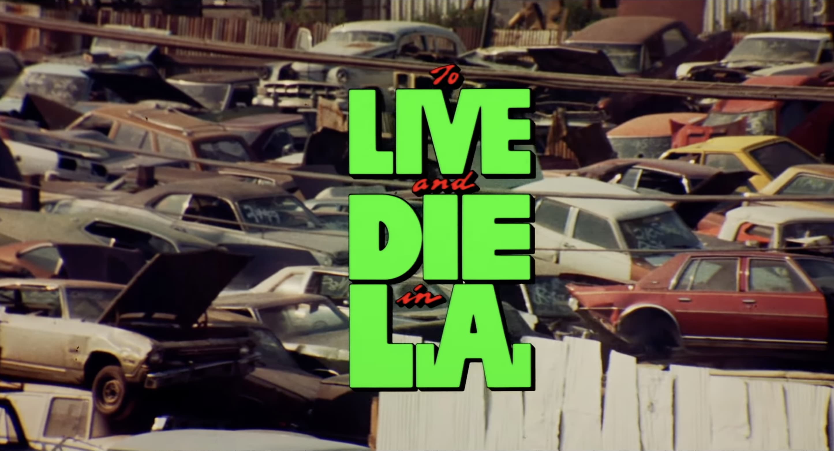
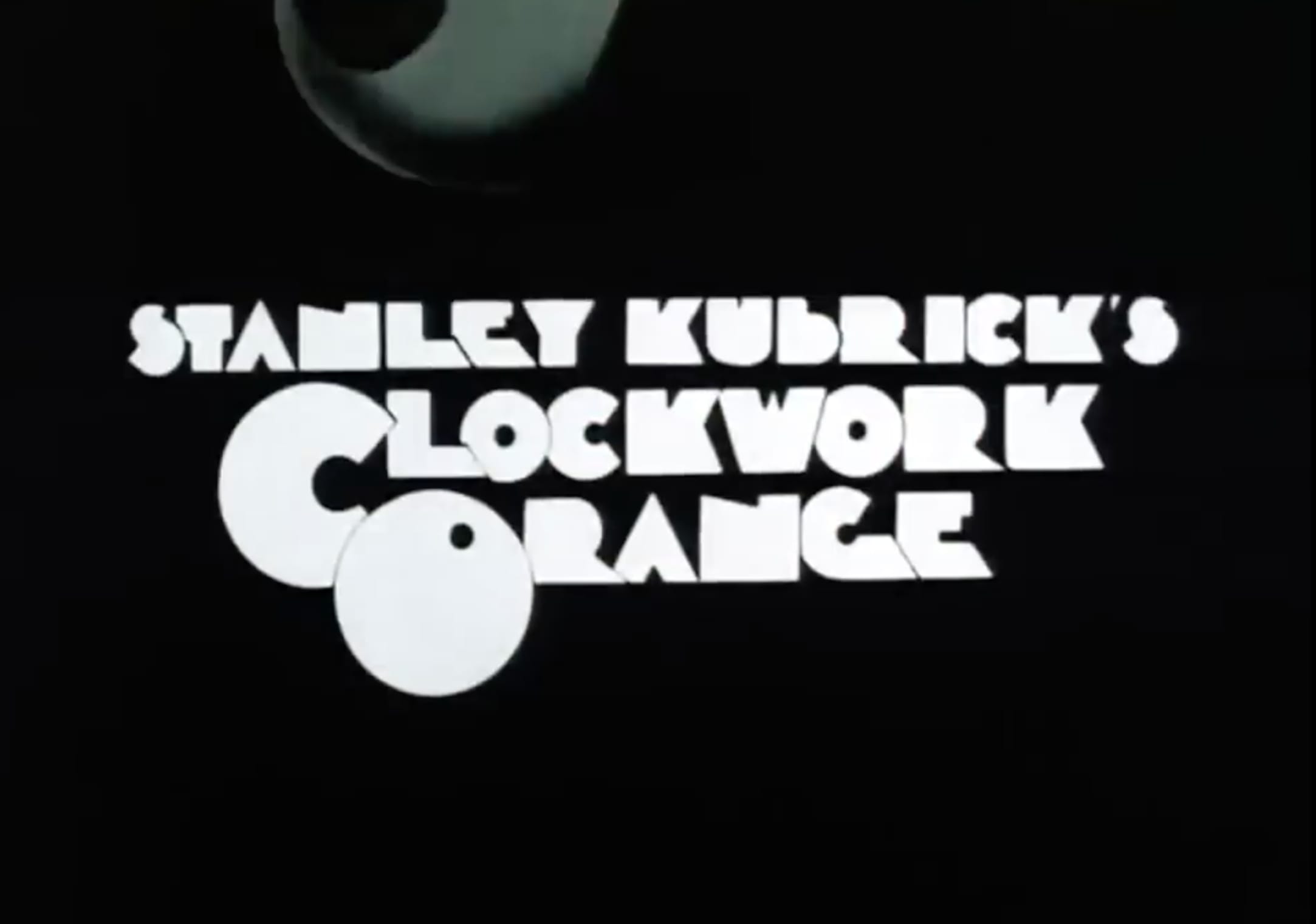
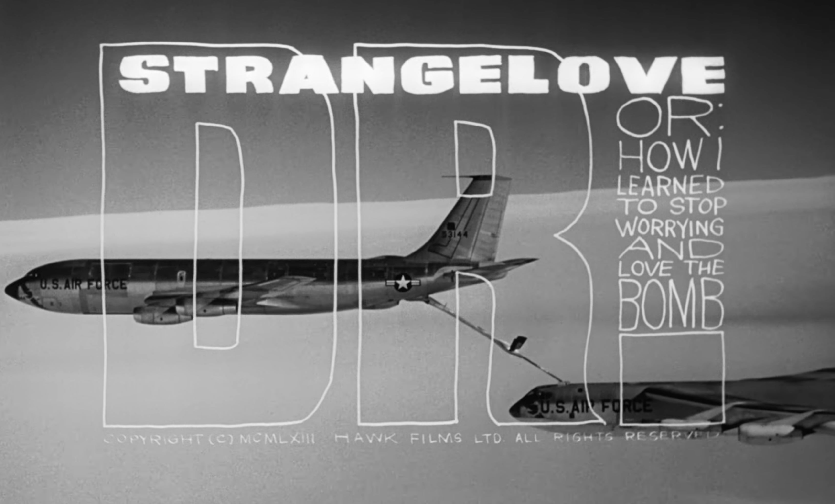
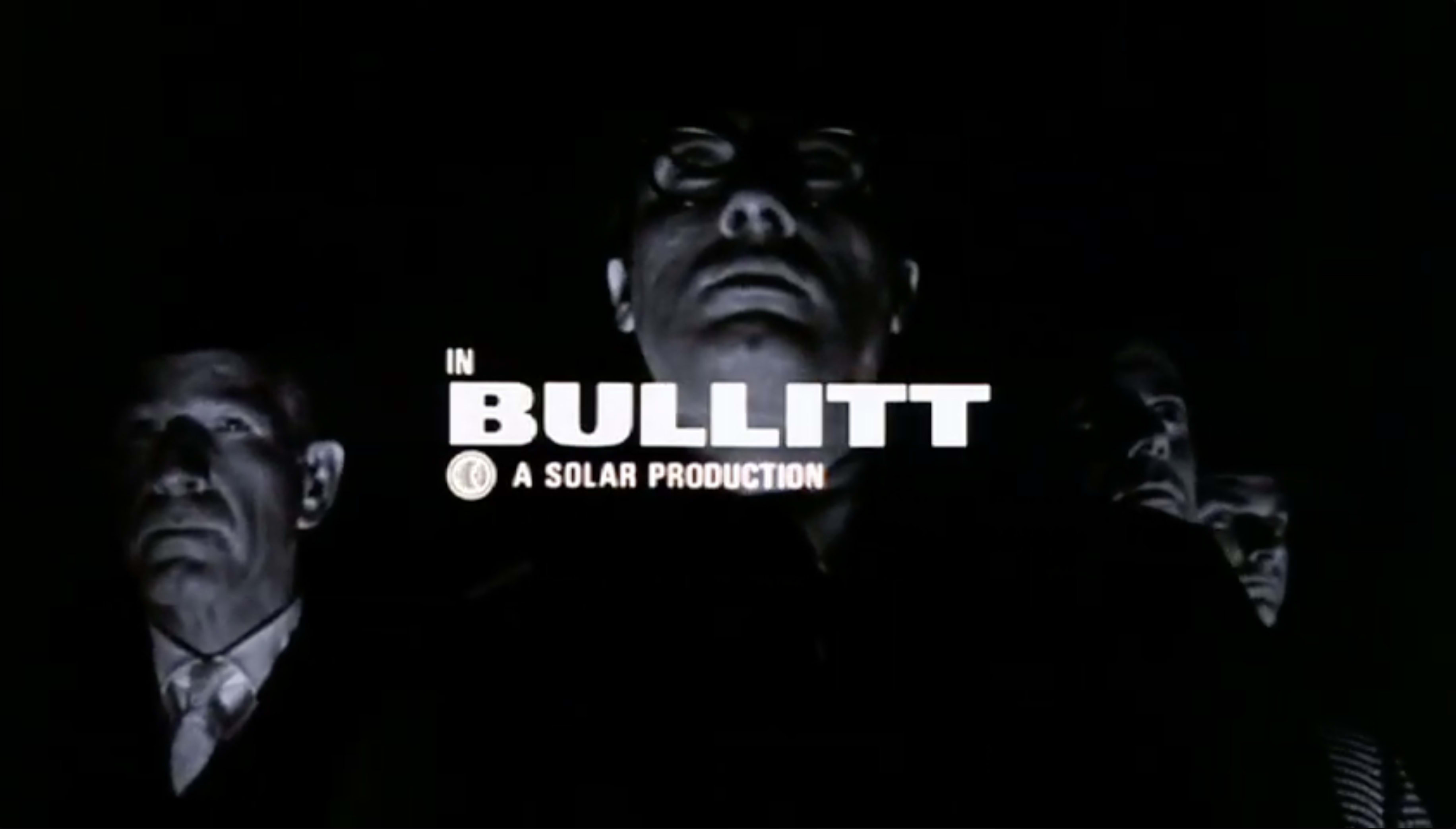
Pablo Ferro left Cuba as a teenager, taught himself animation from a library book, and spent the next six decades proving a film's first thirty seconds could carry as much weight as its last. He built his reputation in commercials before Stanley Kubrick brought him onto Dr. Strangelove, where his loose, hand-scrawled titles ran directly across the frame instead of politely beneath it, a risk no studio picture had taken before. He originated the quick-cut technique and pushed split-screen storytelling into features years before it became a music video staple, work that carried straight through into The Thomas Crown Affair and Bullitt. His title sequences appear in twelve Academy Award-winning films, and his fingerprints show up everywhere he never got credit: any hand-lettered credit, any multi-panel frame, any commercial cut like a fever dream owes him something.
Learn More →Signature Traits
Major Works
Dr. Strangelove (1964)
Hand-scrawled titles run directly over a mid-air refueling sequence set to Try a Little Tenderness. The first time studio credits looked handmade on purpose.
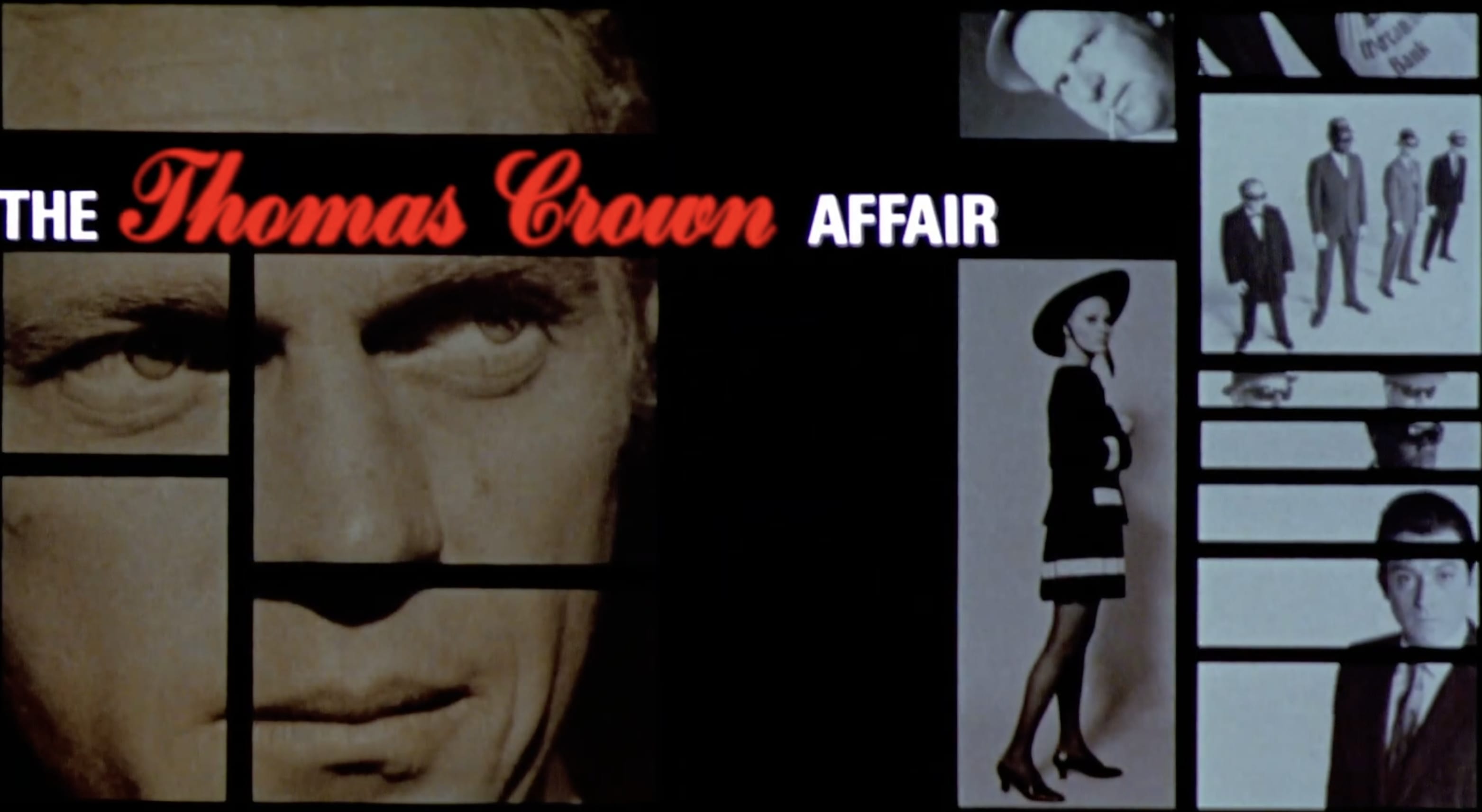
The Thomas Crown Affair (1968)
Multi-panel split-screen storytelling born out of a World's Fair pavilion experiment, repurposed to make a heist feel like a chessboard.
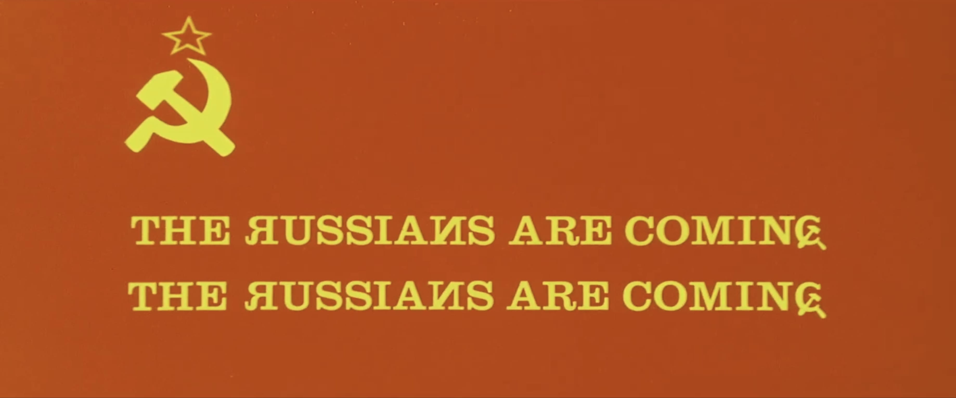
The Russians Are Coming, the Russians Are Coming (1966)
American and Russian flags animated into a literal dogfight over the screen, built around a typeface with backwards Rs and a hammer and sickle standing in for a letter.