Designer
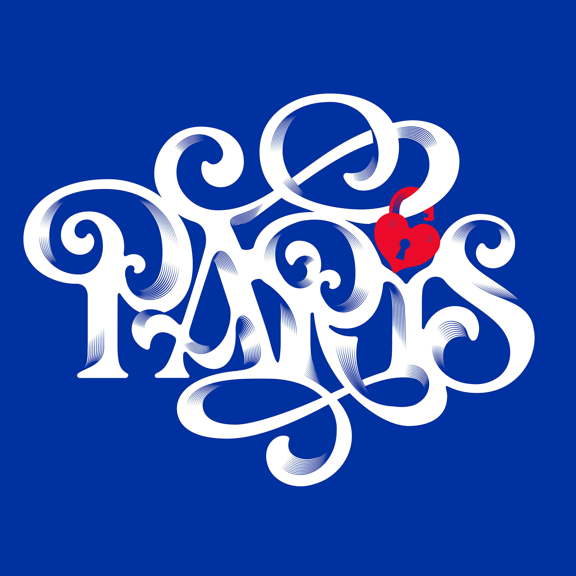

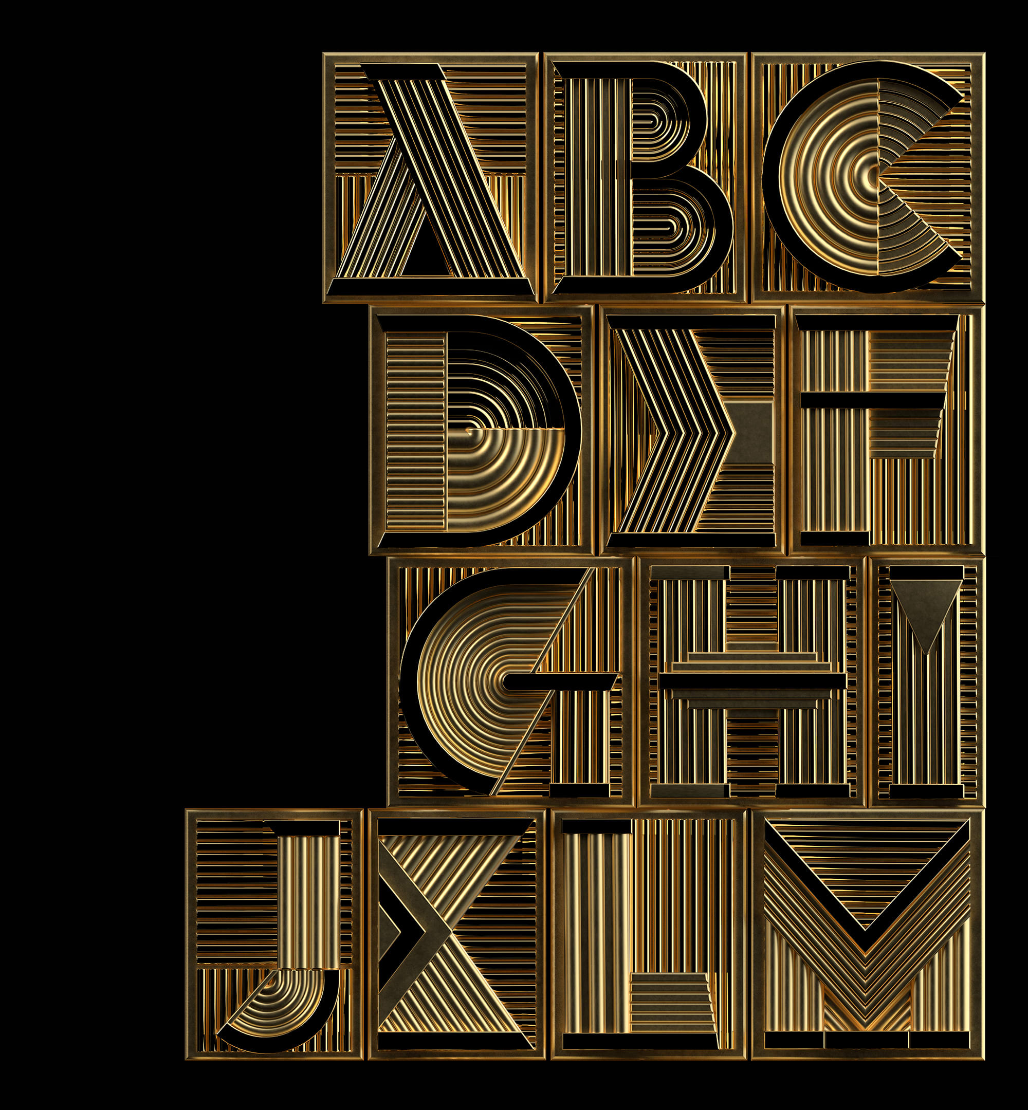
Alex Trochut grew up staring at record covers, skateboard graphics, and video game art in Barcelona, and decided that was reason enough to build a career. Grandson of Spanish graphic artist Joan Trochut, he arrived at typography with something to prove and an inheritance to interrogate. For Trochut a letter isn't a container for meaning, it is meaning, before you've read a single word. He has bent that conviction into work for Nike, The Rolling Stones, and Coca-Cola, pieces that sit somewhere between poster art, sculpture, and fever dream.
Learn More →Signature Traits
Major Works
The Rolling Stones, Rolled Gold (2007)
His introduction to a global stage. The commission that announced a new kind of typographic ambition had arrived.
Katy Perry, Roar (2013)
A letter form so charged with energy it functioned as pure visual sound. Typography doing the work a guitar riff usually does.
More Is More (2011)
His monograph. A document of an artist in full flight, tracing the methodology behind work that consistently refuses to be categorized.